 poolcod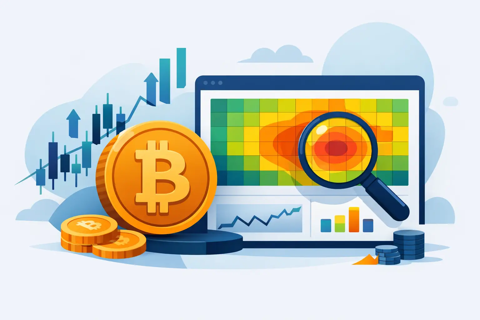
A Bitcoin heatmap converts a large set of market values into color across price and time. Stronger colors usually indicate greater relative concentration, while darker areas indicate less activity. The visual is intuitive, but its meaning depends entirely on which data was used and how the scale was calculated.
What can be represented
An order-book heatmap can display resting bids and offers. A traded-volume heatmap can show where transactions occurred. A liquidation heatmap can display confirmed forced closures or estimated areas where leveraged positions may become vulnerable. These are different datasets and should not share an unexplained label.
How estimated bands are built
Because exchanges do not publish every account's entry, leverage and margin settings, estimated pools rely on market-level inputs. A model can combine OHLC candles, volume, open interest, taker flow and liquidation formulas for several leverage assumptions. It then groups nearby results into price rows and normalizes intensity for display.
The band is therefore a probability-oriented risk region, not a list of exact positions. Row height, sampling interval, historical depth and minimum-intensity filters all affect the final appearance. Two tools can use legitimate methodologies and still produce different heatmaps.
Why colors change
Many heatmaps normalize values against the visible range. Zooming or changing timeframe can alter which pool is the strongest reference and therefore change colors. A reliable interface should preserve the underlying values and make the scale behavior understandable. Brightness is relative unless the platform explicitly states an absolute unit.
How zones evolve through time
New candles, volume and open-interest changes can create or strengthen zones. Exposure can weaken when positions close. A touched pool may disappear, remain as a historical trace or decay gradually depending on the model. Historical columns help show this evolution instead of presenting every level as permanent.
Read the heatmap with price
Start from structure, then identify persistent concentrations near meaningful highs, lows or range boundaries. Observe how price approaches: with volume expansion, ineffective aggression or declining open interest. Confirm forced activity with real liquidation records when possible.
A bright upper band does not force price upward. It says that, under the model's assumptions, the area could contain vulnerable short exposure. A dark area does not mean price cannot travel through it. Spot orders, news and liquidity outside the model can dominate.
Limitations that matter
No public heatmap knows private margin modes, portfolio collateral or every exchange's complete user distribution. Data latency and contract normalization also matter. Small markets can produce unstable intensities, and a model calibrated for Bitcoin may need different thresholds for an altcoin.
The heatmap is best used as a map of conditional fragility. It organizes where risk may concentrate and how it evolved. Price structure, real events and execution controls determine whether that context supports a trade.